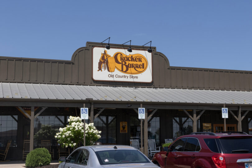
I grew up eating at Cracker Barrels across the country on nearly every family road trip — sometimes three times in a single day. It’s a running joke in my family that we’ve visited every Cracker Barrel between central Virginia and Colorado. I never imagined I’d be writing an article about what the chain taught me about my chosen profession.
I’m sure Cracker Barrel did its homework before unveiling its new look, including focus groups, surveys, reputation analysis. Still, the public reaction was swift, loud and tumultuous. Within a week of announcing the rebrand on Aug. 19, the company walked back the changes.
“If the last few days have shown us anything, it’s how deeply people care about Cracker Barrel. We’re truly grateful for your heartfelt voices,” the company said on Aug. 25 in a statement on its website. “You’ve also shown us that we could have done a better job sharing who we are and who we’ll always be.”
Why did the rebrand explode online and ultimately end in reversal? To those outside our profession, it may seem like a political controversy or just a poor font choice. But to communicators, the lesson runs deeper.
Rebranding isn’t cosmetic — it’s cultural.
As we know, rebranding is never as simple as swapping out fonts, colors or even names. A rebrand is a business decision, and often one that requires communicators to manage the fallout, no matter how unpredictable.
In Cracker Barrel’s case, the company understood the business need: evolve to meet the expectations of younger consumers. On a Sunday at 11 a.m., twenty-somethings might want a chic brunch with lattes, not biscuits and a round of checkers. But what the rebrand underestimated was the sentimental equity of memory.
The announcement, amplified by media coverage and social platforms, struck a deeper nerve: fear of losing traditions that feel like anchors in an unpredictable world.
Nostalgia as brand equity.
Americans cling to routines and touchstones that give stability. For some, that’s a homestyle meal served with black coffee by a familiar, chatty waiter. For others, it’s rocking chairs on a front porch or peppermint sticks at the register.
Cracker Barrel didn’t just underestimate a design preference — it underestimated the strength of memory as brand equity. The antiques on the walls and the country knick-knacks aren’t just decoration; they’re symbols of identity, continuity and belonging.
That’s why people from both sides of the political aisle criticized and later rallied around the brand. In an era when Americans are led to question their identities daily, a familiar restaurant becomes more than a place to eat. It becomes a stand-in for normalcy.
The PR lesson.
For communicators, the Cracker Barrel episode is a reminder that rebranding is never just a marketing decision. It’s a cultural decision. A logo may be designed in a studio, but it lives in people’s memories for decades.
Market research can test perceptions, but it can’t always measure the power of nostalgia. Before changing what people love, brands must understand what customers hold sacred.
The public wielded its power — amplified by social media — to cancel a rebrand that threatened to “fix” something many didn’t think was broken. That power should never be underestimated.
As for me, I’ll still happily order my biscuits and black coffee on the road. And I’ll leave you with one lighthearted plea: Let’s keep eggs Benedict off the Waffle House menu.
Grace Wilbanks is an Atlanta-based communication and public relations specialist who holds a bachelor’s degree in Public Relations and a Certificate in Public Affairs Communications from the University of Georgia.
Photo credit: jetcityimage — stock.adobe.com


The wonder of human nature and mother nature are mighty forces.
Article hit the nail on the head. Don’t mess with human nature.
Branding isn’t about a logo, it’s the feeling you get when you hear a company’s name, or think about it, or use/eat its products. The best visual branding reinforces the feeling. Visual branding can’t stand alone, it has to be backed with the feeling. Cracker Barrel has banked on familiarity, the “Old Country Store” aesthetic. The visual-branding refresh appeared on the surface to ignore that.